JOURNEY PR & MARKETING I Brand Identity
The concept behind Journey’s logo captures the essence of collaboration, unity, and mutual success. Created for a renowned minority woman-owned PR agency, this logo reflects the founder’s vision of working shoulder to shoulder with clients to achieve shared goals. It’s not just about showing clients the way—it’s about traveling together, on the same path, towards the same destination.
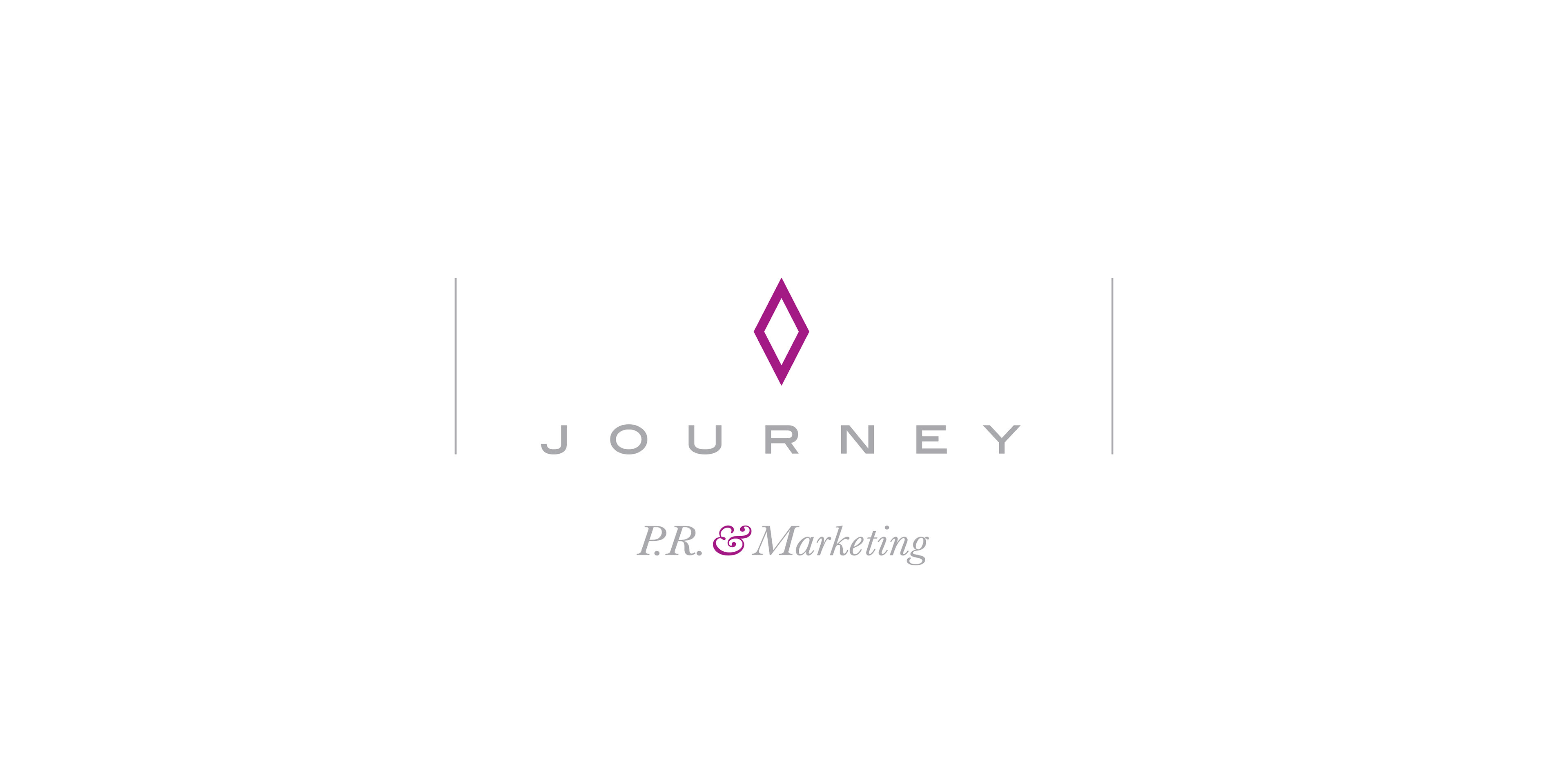
The logo’s central icon is a stylized representation of a carpool, a metaphor for teamwork and collective progress. The carpool symbolizes the idea of shared journeys—whether it's moving forward quickly on the freeway or enjoying the ride together. This reflects the agency’s philosophy: success is best achieved when people come together, moving as one.
The diamond shape integrated into the design is both a tribute to the agency owner’s unique and rare personality and a symbol of the exceptional quality of service provided. Diamonds are rare, valuable, and resilient—just like the agency’s approach to PR. The icon itself is simple yet dynamic, capturing the balance of professionalism and human connection that defines Journey.
The choice of a contemporary, clean font complements the icon’s modernity, while the color palette blends sophistication with warmth, ensuring the brand feels both professional and approachable. The overall design reflects the agency’s innovative approach while staying true to its core values of collaboration, empowerment, and shared success.